
進入市場一定要會的兩個工具,一是基本面分析,一是技術面分析,透過基本面與技術面的相互參酌而得到比較完整的訊息。 XQ在技術分析功能中,提供許許多多的指標作為分析研究,還有一些操作應用,讓我們趕快學習如何使用吧!
※本篇重點摘要: 1. 如何切換週期頻率 2. 放大縮小K線 3. 固定查價/除權息/高低價、叫出查價線 4. 主圖指標設定及參數設定
※小編貼心提醒:影片播放時,可點選影片播放器右下角的「齒輪圖示(設定)」,可切換播放畫質為1080p,以享有較佳的觀看畫質。
 圖文介紹:
圖文介紹:(一)如何切換週期頻率
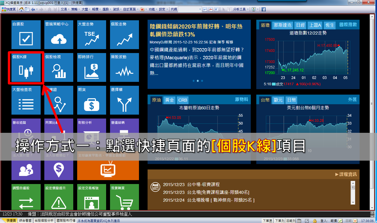
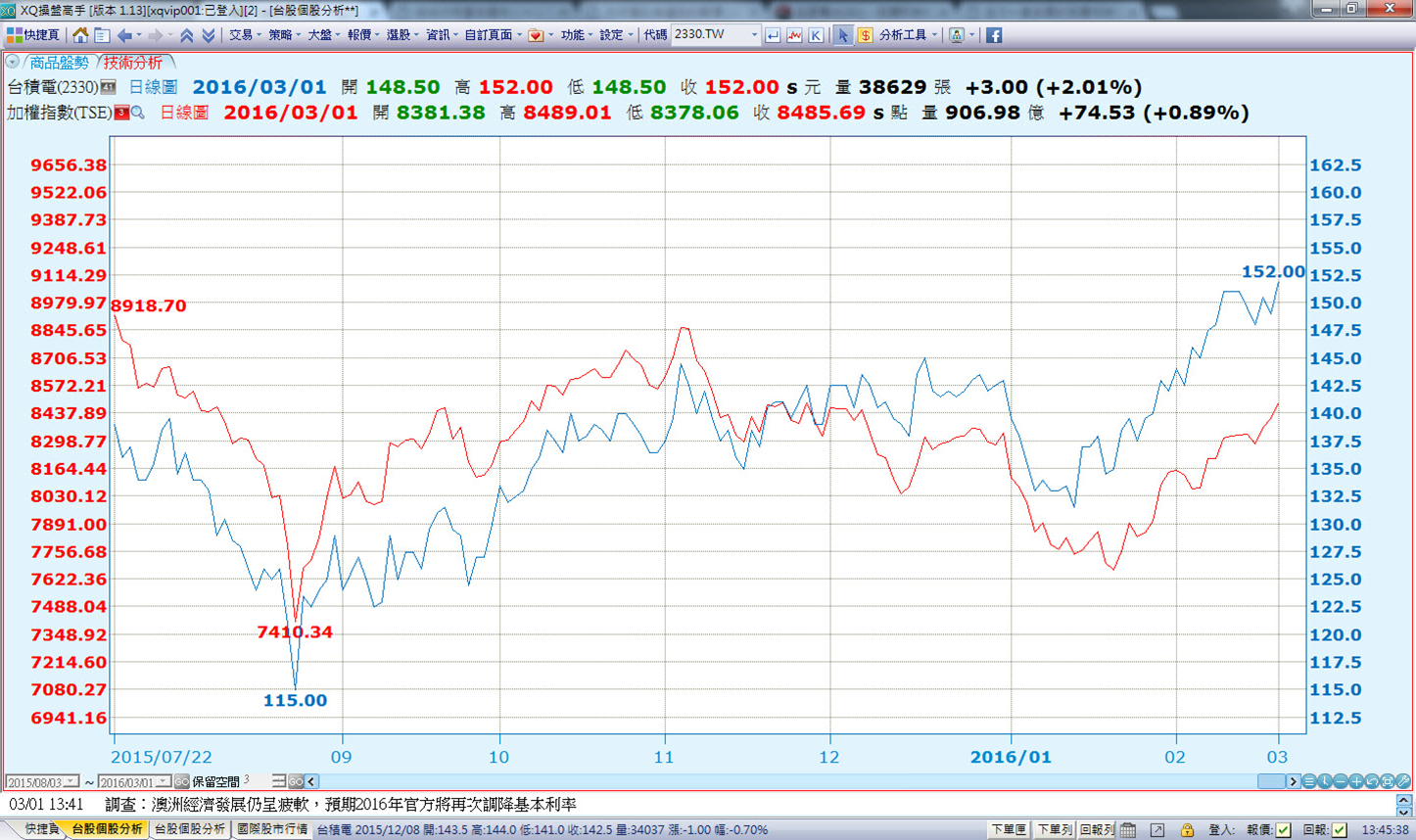
1.進入技術分析畫面:

2.畫面說明:
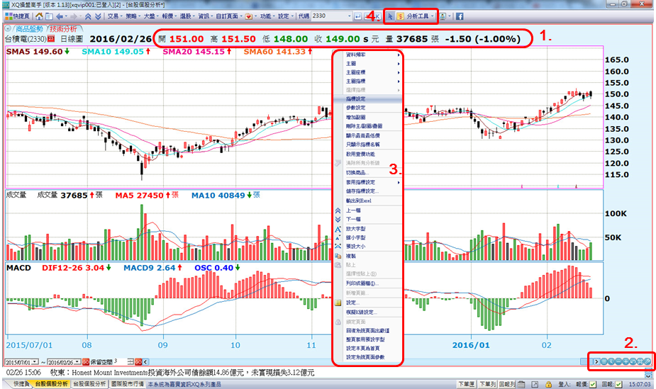
(1) 呈現最新報價資訊,收盤價後方的符號:[

]表較前一價格 上漲、[

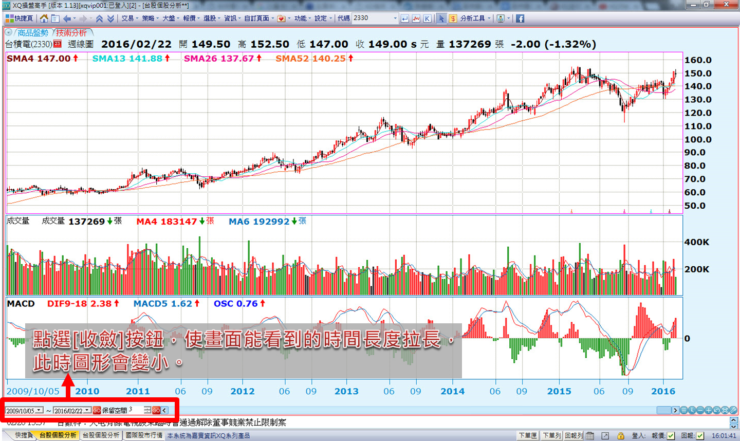
]表較前一價格下跌、[=]表與前一價格持平、 [S]表示己收盤,該數值為收盤價。 (2) 改變資料區間:圖形下方出現的:[收斂]按鈕(

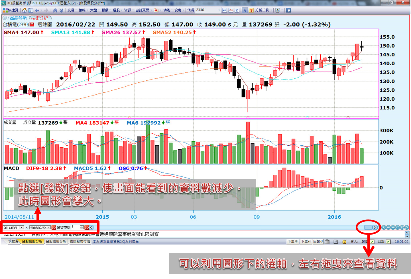
) 表示壓縮資料,使畫面能看到的時間長度拉長,此時圖形會變小;[發散]按鈕(

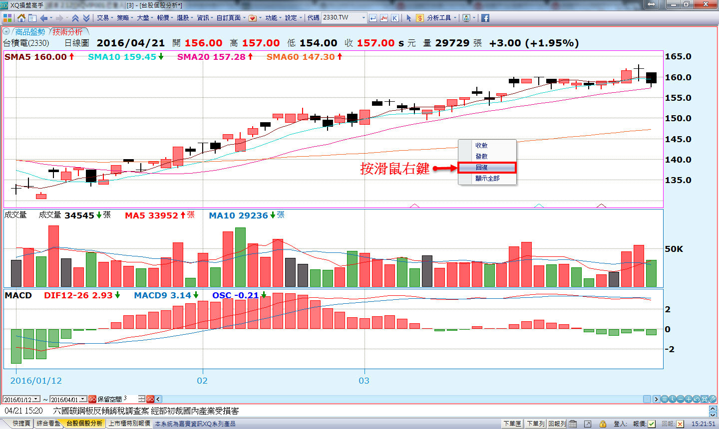
) 表示減少資料,使畫面能看到的資料數減少,此時圖形會變大;[回復]按鈕(

) 表示回復到系統預設狀態;[區間放大縮小]按鈕(

) 可自行拖曳資料區間;您也可以利用圖形下的捲軸來查看資料,點[指標設定]按鈕(

)則可以進行技術分析的主圖指標及副圖指標設定。 (3) 可利用工具列中的分析工具進行畫線分析,詳細功能,請參見下一篇教學介紹:
技術分析基本操作(二)。 (4) 在畫面上按滑鼠右鍵,會出現功能選單,可以切換資料頻率、主圖類型、副圖類型等項目。 3.切換週期頻率: (1) 點選右下角小時鐘按鈕,可設定切換商品的週期,資料頻率完整;左上則會對應顯示目前所選擇線圖。
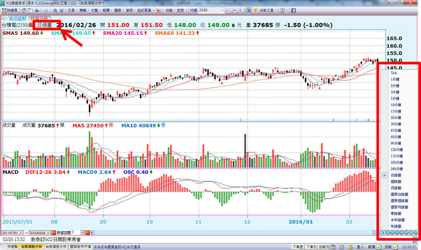
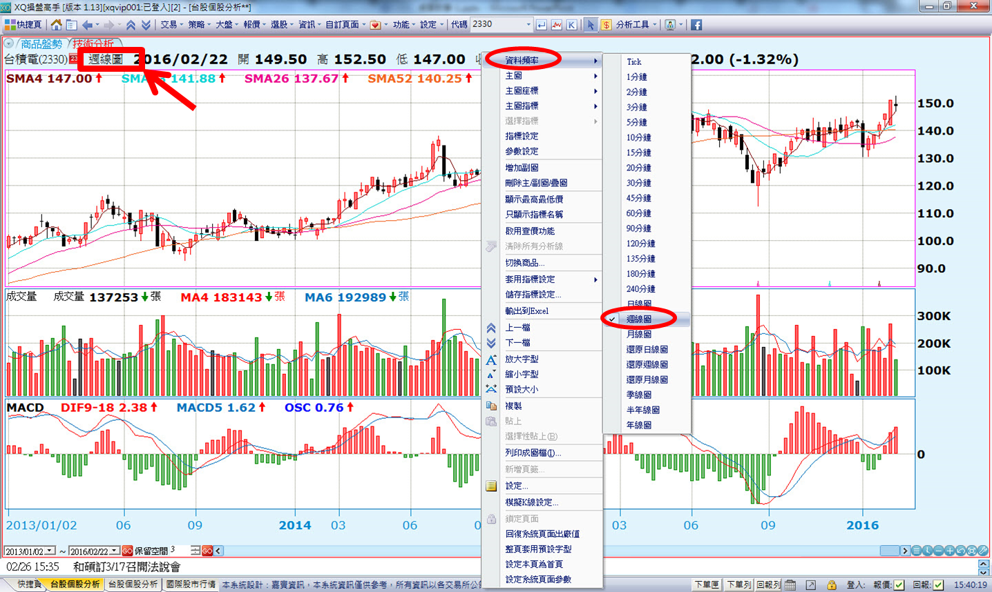
(2) 或是直接在畫面上按右鍵,也可快速選擇[資料頻率]。
(二)放大縮小K線
1.點選圖形下方的 [收斂]按鈕(
) 表示壓縮資料,此時圖形會變小;
2.點選[發散]按鈕(
) 表示減少資料,此時圖形會變大;點選[回復]按鈕(
) 則表示回復到系統預設狀態。
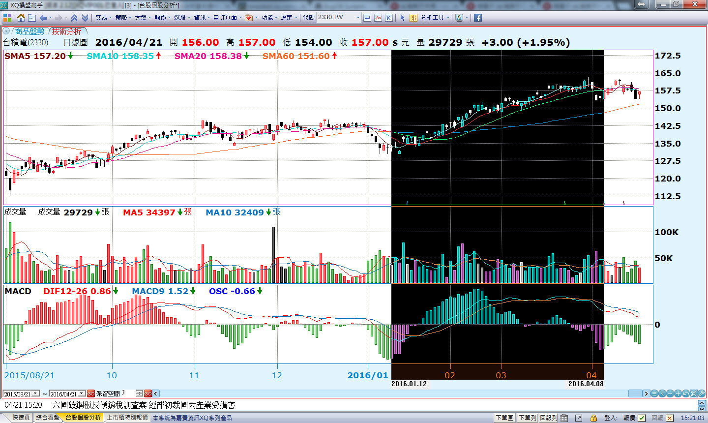
3.點選[區間放大縮小]按鈕(
) 可自行拖曳顯示區間K線圖;啟用此功能時,單擊滑鼠右鍵,選擇[回復],則可以回復到系統預設狀態。
(三)固定查價/除權息/高低價、叫出查價線
1.進入方式:由技術分析→滑鼠右鍵→選擇「設定」/【一般】Tab。 2.勾選「標示區間最高價及最低價」、「標示除權息資料」、「固定顯示查價視窗」。
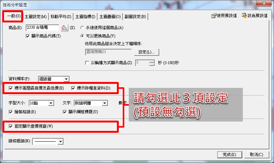
原技術分析圖形:

增加設定後的技術分析圖形:
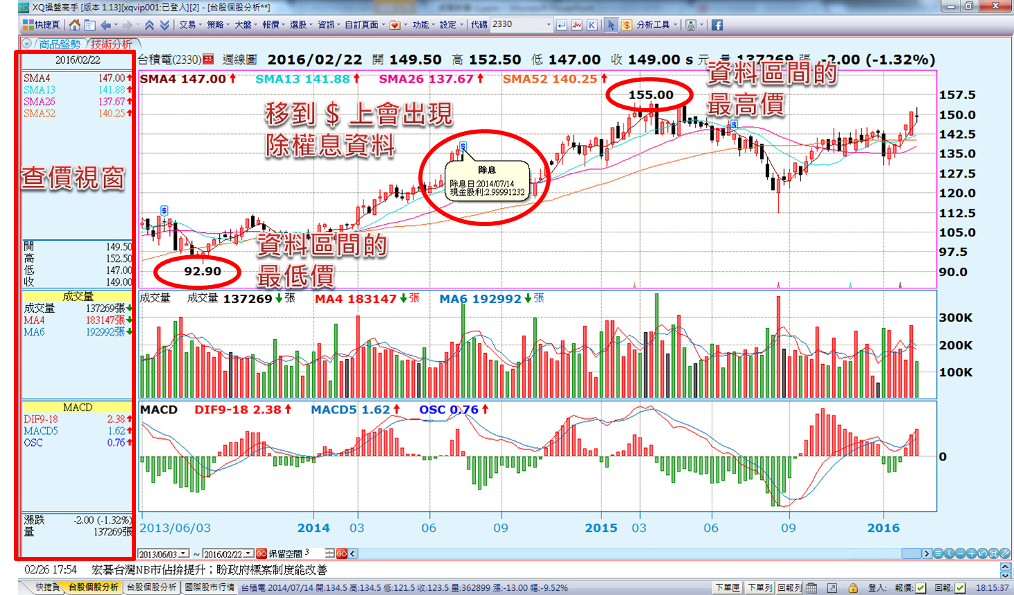
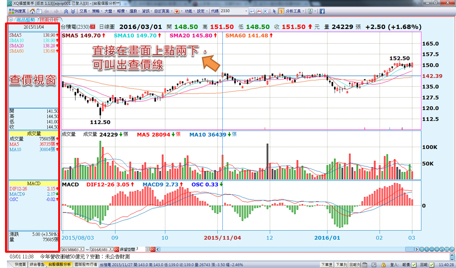
3.叫出查價線: 直接在畫面上以滑鼠點兩下,便可進入查價狀態,按Esc取消查價狀態。若勾選「固定顯示查價視窗」並啟用查價線功能時,查價資訊會固定顯示在畫面的左側。
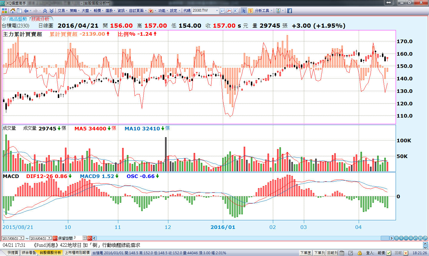
(四)主圖指標設定及參數設定
在畫面上方這塊較大的圖,我們叫做主圖:
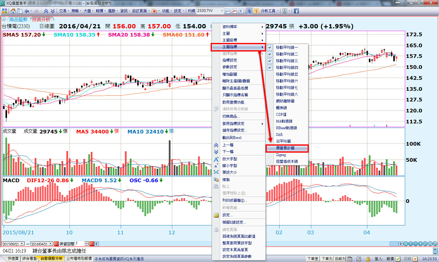
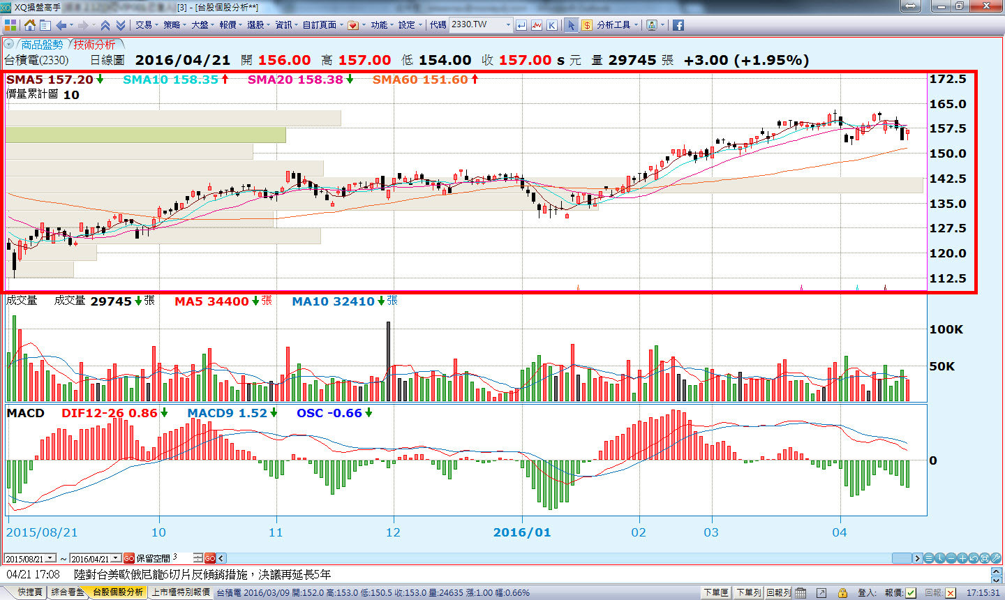
在主圖上面點滑鼠右鍵,選擇[主圖指標],可以看到所有可以加入的主圖指標,打勾表示已顯示在畫面上了,我們再加入一個「價量累計圖」看看:
價量累計圖的深色橫條表示為現價,最大量則表示可能為支撐或壓力所在。
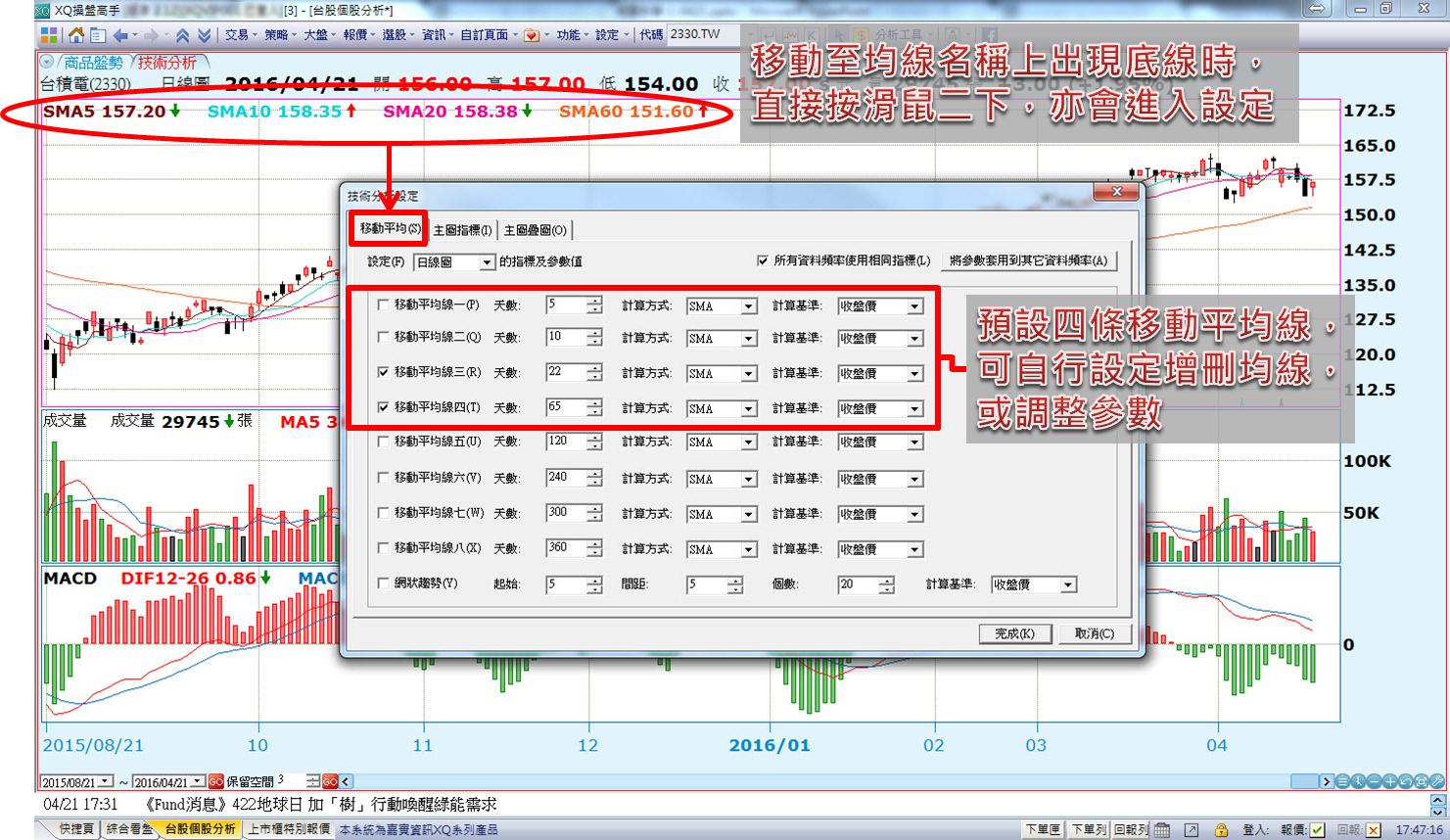
在主圖上預設為四條移動平均線,但如果現有的均線參數,都不是您想要的呢? 我們可以點選滑鼠右鍵,進入[指標設定],在第一個"移動平均"頁籤可以勾選要顯示幾條均線,以及可以自行修改均線周期,例如我們只留兩條均線,把參數改為22和65,按下完成;這時候圖上的均線,就是我們要的均線囉! 您也可以在主圖的左上方,雙擊這個指標的名稱,可以快速進入參數設定的畫面喔!
主圖調整為顯示兩條22和65的均線如下:

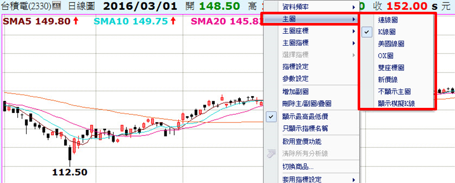
主圖也可以切換為其他指標,我們直接在畫面上點按滑鼠右鍵,選擇「主圖」,預設為K線圖,可以切換為其他主圖類型,例如連線圖、K線圖(預設)、美國線圖、OX圖、雙座標圖、新價線、不顯示主圖、顯示模擬K線..等。
例如以台積電為例,切換主圖為「雙座標圖」如下:
最後和大家介紹主圖疊圖指標,我們可以把許多平時放在副圖來看的指標,也加到主圖上面; 請點選滑鼠右鍵,進入「設定->主圖疊圖」頁籤,系統預設有許多可以加到主圖上的指標,例如我們將"主力累計買賣超"給疊上來,指標的參數、樣式和顯示座標範圍都可以自行調整。 關於主圖疊圖指標,大家可以進一步參閱「XS學院->
XS自訂指標」系列文章,將帶您更深入的了解各種用法。

這樣的主圖疊圖,是不是更有助於您的投資判斷呢!
下一篇我們將繼續介紹技術分析其他重要操作功能,學習就是要打鐵趁熱,我們繼續看下去吧!
 進入市場一定要會的兩個工具,一是基本面分析,一是技術面分析,透過基本面與技術面的相互參酌而得到比較完整的訊息。 XQ在技術分析功能中,提供許許多多的指標作為分析研究,還有一些操作應用,讓我們趕快學習如何使用吧! ※本篇重點摘要: 1. 如何切換週期頻率 2. 放大縮小K線 3. 固定查價/除權息/高低價、叫出查價線 4. 主圖指標設定及參數設定